The Frisco Station logotype is a structured mark, designed to showcase the innovative, smart, healthy, creative spirit of Frisco Station.
COLOR
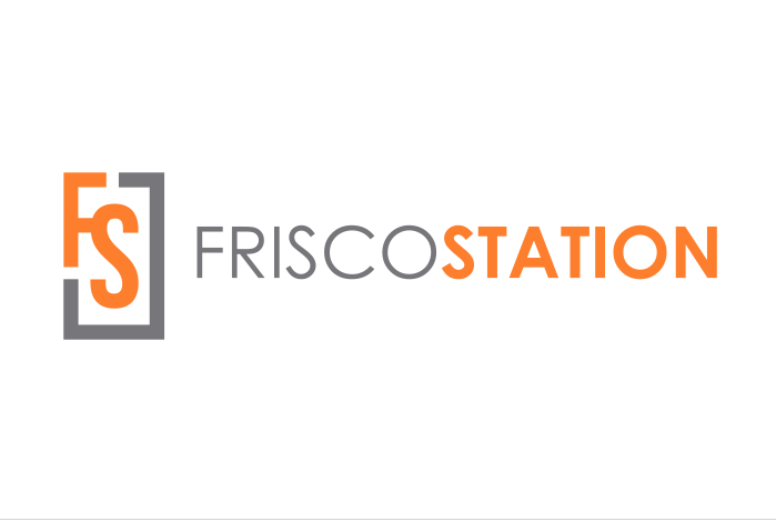
There are 4 versions of the logotype to ensure legibility and optimum reproduction quality in all printing processes and digital needs.

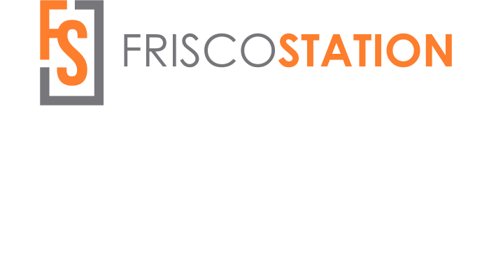
Full Color
Light Background
#FF7E2E
PMS 1575
C0 M62 Y86 K0
#777779
PMS Cool Gray 9
C0 M0 Y0 K60
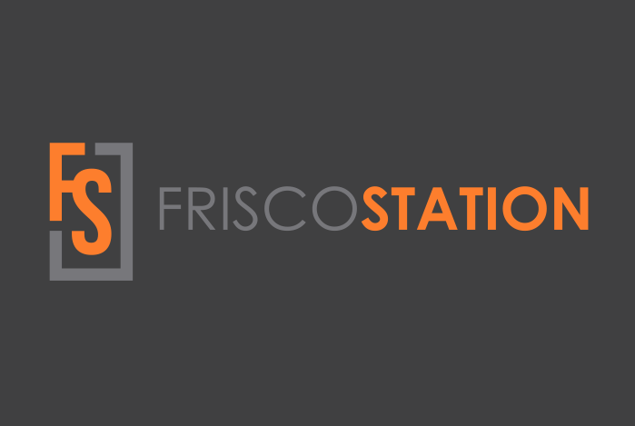
Full Color
Dark Background
#FF7E2E
PMS 1575
C0 M62 Y86 K0
#777779
PMS Cool Gray 9
C0 M0 Y0 K60
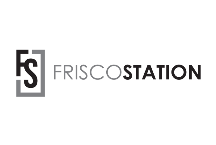
Monochrome
Light Background
Pure Black
100% | 60%
Monochrome
Dark Background
Pure White
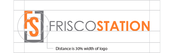
CLEAR SPACE
The clear space around the logotype on all sides should be equal to the height of the letters for maximum legibility and impact.
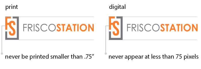
MINIMUM SIZE
To preserve legibility, the logotype should never be printed smaller than 0.75″ and should never appear less than 75 pixels.
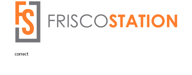
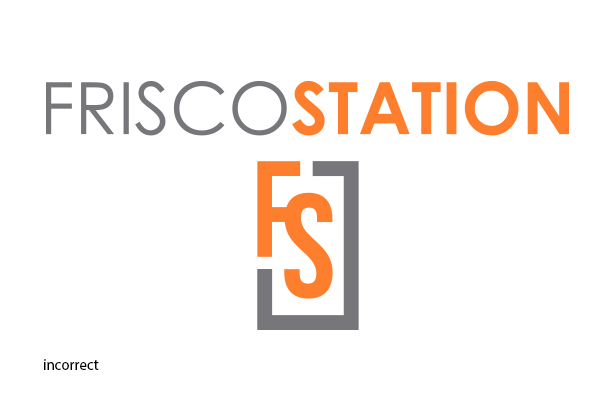
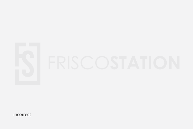
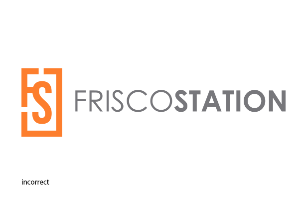
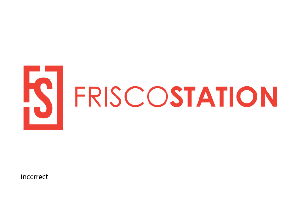
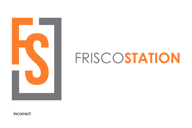
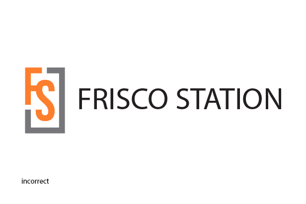
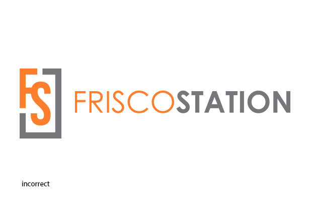
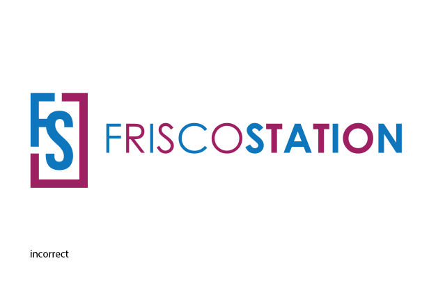
IMPROPER USAGE
The Frisco Station logotype should not appear in colors other than brand colors, black or pure white. The logo should never appear any other way than what we have expressed in this guide.
LOCKUPS
The Frisco Station logotype should always be used in its original state whenever possible. For any instance it can not, the following lockups are approved for use.
![]()
The Icon
The icon was designed for signage and can be used on its own to represent Frisco Station.
![]()